Coding support
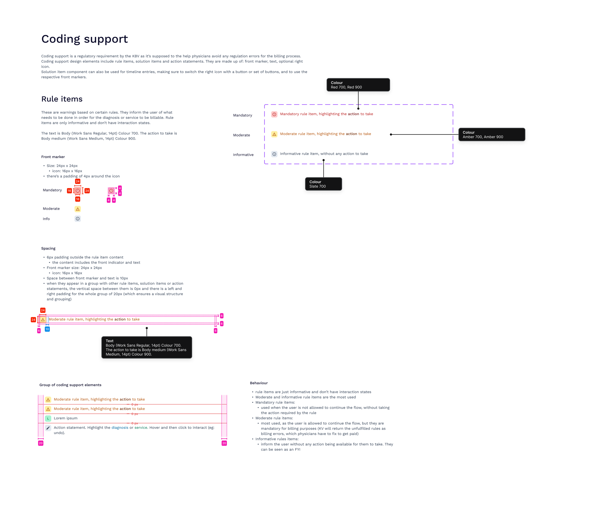
Coding support is a regulatory requirement by the KBV as it’s supposed to the help physicians avoid any regulation errors for the billing process.
The Problem
The coding support warning system that we had in effect within the platform was severely hindering user productivity and creating a negative user experience as it was rudimentary and not initially planned for design. We got a lot of negative feedback and this project soon took top priority. The jarring nature of the warnings was creating extremely frustrating road blocks in our users’ task flow. The limitations manifested several key areas:
Disruptive User Experience: The pop-up format interrupts the doctor's workflow, causing frustration and inefficiency.
Lack of Clarity: The warning messages often fail to provide clear and actionable information about the underlying billing complexities.
Limited User Control: Doctors determined that a lot of the warnings could be easily handled with just a click of a button and although the warning reminds them of a task, it stops the user from completing the current task at hand (sometimes because some of these warnings cannot be ignored due to regulations) and they would have to disrupt their flow and go resolve the previous issue ultimately leading to a lot of lost time, additional admin work and increased frustration.
These factors collectively contribute to a suboptimal user experience and potential errors in the coding process.


The Solution
To address the challenges posed by the existing warning system, a comprehensive redesign was implemented. The primary objective was to create a less intrusive and more informative warning system that empowers users to resolve issues efficiently.
Warning Categorization: To minimize workflow disruptions, warnings were categorized based on urgency and importance. Critical alerts required immediate attention, while less critical warnings could be deferred. This tiered approach allowed users to prioritize tasks and manage their workflow effectively.
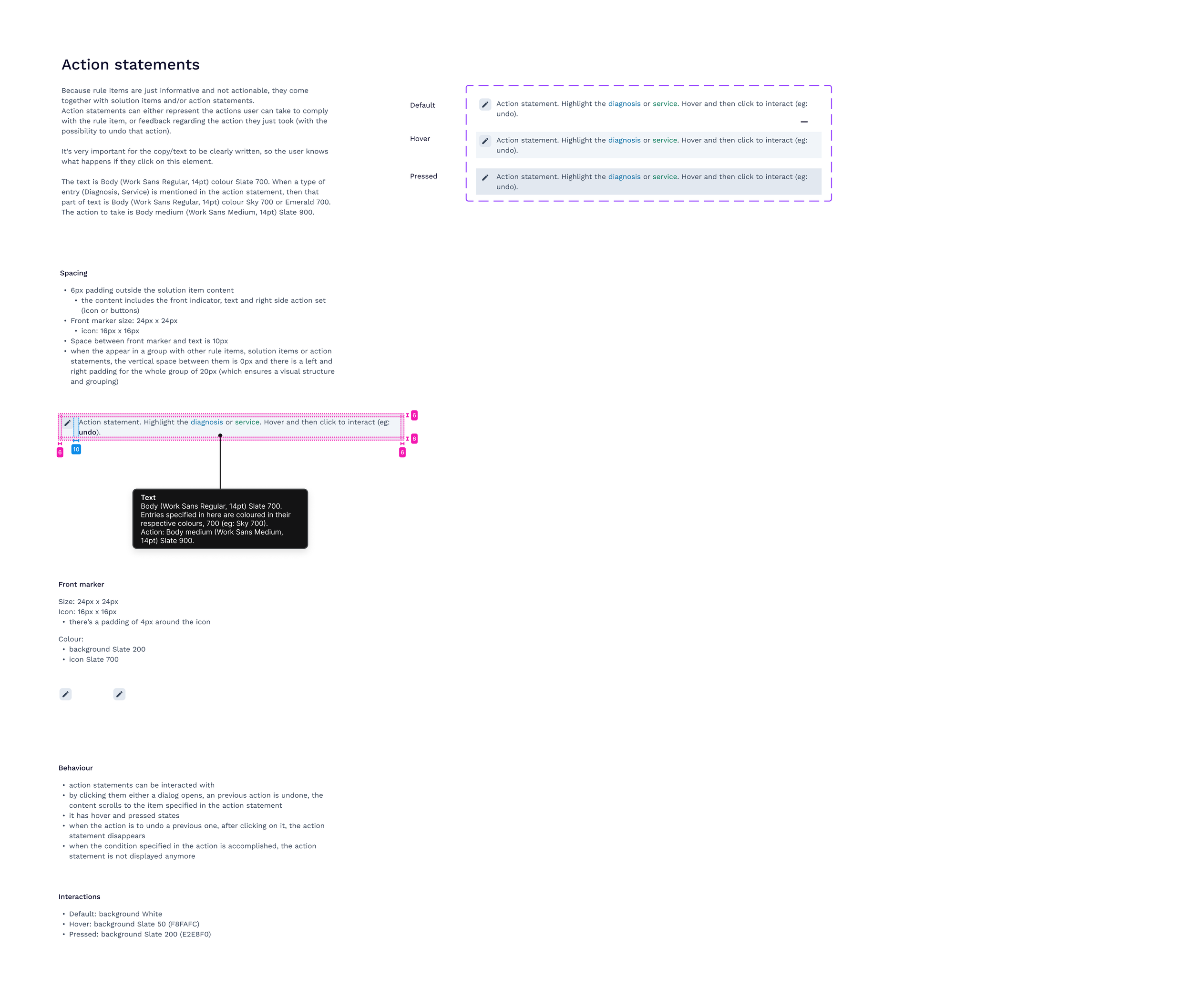
In-Context Guidance: To empower users to resolve issues independently, each warning included clear and actionable guidance. This approach reduced reliance on external support and enhanced user autonomy.
Visually Appealing Design: A visually unobtrusive and informative warning display was developed. The new design incorporated subtle cues to indicate the warning's severity while maintaining a user-friendly aesthetic.
By implementing these design enhancements, the goal was to create a warning system that is both informative and supportive, ultimately improving the overall user experience and reducing frustration.


The Process
There was a lot of research done on the issues users faced as there were a lot of complaints that were raised in this department so we had a lot to work with in terms of user feedback. Most problems were easily evident such as the visual appearance of these warnings or the jarring nature of them. We had time to explore different visual options for different categories of these warnings sorted by criticality.
Other problems that arose were something of a different nature: Our main product was unique in a way that we were granted a certain freedom to explore solutions that were not tried before and test it on an immediate basis. We decided that users had to be allowed to complete any compulsory actions on the spot without guiding them away from other tasks. We created unique additions to our new warning elements that included actionable elements that could be sorted out then and there. The warning came with an extendable card that allowed users to resolve any issue they missed.
We covered detailed flows of all these warnings, their severity and nature through out every aspect of the product. We had a list of regulations that were needed to be followed and used this to connect all warnings and actionable items to relevant areas where these issues could be solved. There were various flows that determined where the users would be led to solve, delay or report an issue as a lot of tasks were conditional and dependent on each other.
This was a massive success and a lot of users reported at least a 60% rise in speed and productivity after the new warnings were implemented. Each of these new warnings and elements were added into the design system with specific details of color codes, sizes, alignment and usage.
